Thursday, June 30, 2011

mark reigelman: breaking the bottle at heller gallery

mark reigelman: breaking the bottle
heller gallery, new york city
on now until july 
30, 2011


'breaking the bottle' by mark reigelman at heller gallery
all images courtesy of mark reigelman


brooklyn-based artist mark reigelman has created 'breaking the bottle,' a site-specific installation on display at new york city's heller gallery
taking cues from the handmade glass defenses found on fences and rooftops worldwide, this work encrusts twelve household objects, including chairs, lamps, and a bearskin rug, in protective layers of broken shards. 

the collection is placed on a pedestal with dimensions matching the artist's childhood living room, arranged to suggest a familiar domestic landscape. 
however, the green color and crystalline surface texture evoke clipped, performative topiaries of the outdoors: 
the innate danger and hostility of glass shards make them useful barriers, but they also greatly isolate the objects contained within.

reigleman's abrasive integration of this material in a typically comforting interior subverts expectations to examine increasingly blurred distinctions between public and private domain.


the objects' functionality is maintained, such as the lamp's illumination and the mirror's reflective properties, to convey a familiar scene


installation view


all objects are true to scale


photo studio installation process


photo studio installation process


glass covering in progress

integrating reigelman's background in both sculpture and industrial design, the systematic process of 'breaking the bottle' took three months to complete. 
each object is composed of about 40 layers of glass shards, and the installation altogether uses over 1,000 pounds of 100% recycled glass and 20 gallons of adhesive epoxy resin. 


glass covering in progress


glass covering in progress

source: DesignCoast

H3T architects: bike sauna

'bike sauna' by H3T architects
all images courtesy H3T architects


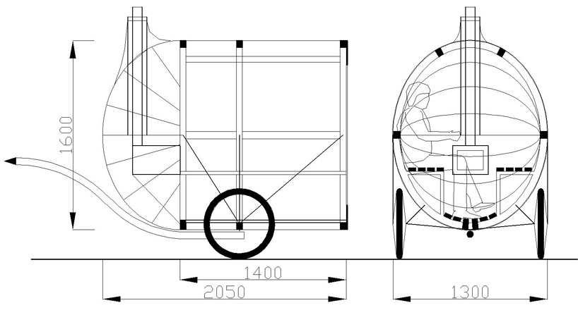
czech republic-based practice H3T architects (vitek simek, stepan rehor, matej velek) has sent us images of 'bike sauna', a transportable sweat lodge pulled by a tandem bicycle. constructed out of light and durable materials for maximum ease of use, the project serves as a new and unconventional social tool that interacts with its immediate site.


exterior view

able to accommodate up to six people, the sauna is encased in a cylindrical volume clad in translucent panels. featuring a fully-functioning fireplace that expels smoke through a tiny protruding chimney, the interior is outfitted with a set of wooden benches. access is provided through a slit on an elastic membrane which keeps in the heat during use. the prototype is a platform for testing ideas, exploring the possibilities of portable architecture with a clear social function.


(left) interior
(right) in use


sections


via designboom


source: DesignCoast

crescent handle by rafael gonzalez urdaneta


crescent handle - chrome

'crescent handle' by rafael gonzalez urdaneta from canada is one of the shortlisted entries from our recent designboom competition 'hands on door handles' organized by designboom in collaboration with COLOMBO design.
the door handle contest 
yielded entries from more than 6, 000 participants and has been juried by UK designer jasper morrison and US-based reiser and umemoto architects.


crescent handle - brushed


'I was thinking about what a door handle is, and how if simplified to its basic function it can be considered an interface between the user and the door, an integrated tool that stays in place to help the user activate the mechanism that unlocks the door and lets him go through and would be virtually not accessible to the naked hand if this element was not present. 
so after this analysis I compared to other existing tools that would provide a similar way of grabbing and turning the pin that unlocks the door, and I found that a wrench could be used to do just that. this handle would be cast metal with a spun metal base, as any of the other handles in colombo design catalogue. I included different finish options that I think could work'. 
rafael gonzalez urdaneta


crescent handle - gold


chosen as one of the 165 overall shortlisted projects, 'crescent' was selected from the 'freestyle' category of the competition, in which we asked for experimental designs that still manage to match the specified technical requirements indicated. 
designboom is currently publishing the most common 'variations on a theme' received, and more than 20 types of door handles working with a similar concept as 'crescent' were submitted to our competition.


crescent handle - gunmetal black


crescent handle - on door

---
those wishing to republish an excerpt of this article, please have the courtesy to link back to this original article, and to mention that the project
 was conceived for the designboom and  COLOMBO award: 'hands on door handles'. 


designboom would like to invite our readers to an evening at the triennale di milano. 
organized in collaboration  with colombo design, the event will feature a lecture by french designer jean marie massaud and will reveal the results of the international door handle competition 'hands on door handles'.
cocktail reception to follow. free entrance.


small details make up the big picture.
landscape, architecture, interior design and door handles.

triennale di milano - sala d'onore, viale alemagna 6, milan 


via designboom 

source designcoast

Monday, June 27, 2011

Bunniguru as a Bridge to Porcelain Art Toys


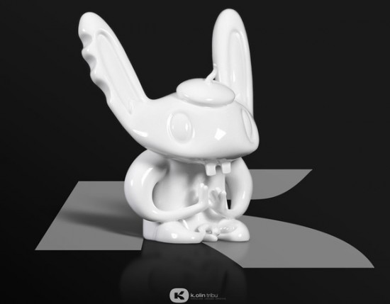
There are a couple of upscale contenders vying for the "____ is the new vinyl" tagline in the toy art world. Fiberglass and bronze have been gaining fans (amongst those who can afford them), and now, porcelain is poised to make its mark. Porcelain is not necessarily a new material to be tried by toy artists. Jamie Hayon's did this Fantasy Collection for Lladro, and Frank Kozik is rumored to be working on a porcelain project. Despite this, the distinctly un-toy medium has yet to truly "cross over". A certain bunny guru may change that…
Nathan Jurevicius tweeted some photos of a 7-inch porcelain Bunniguru he's been working on with France's K.Olin Tribu, whose website, appropriately enough, is:http://www.artandtoys.com. Nathan's Scarygirl characters released in the early 2000s through Flying Cat and STRANGEco were some of the first and favorite art toys for many stateside collectors. With the scene in a state of change currently, it will be interesting to see if Bunniguru is a bridge to further acceptance of toys in the art world (and, conversely, higher-priced art objects in the toy scene).
No price is available yet, but comparatively, K. Olin Tribu has produced a porcelain piece for Steph Cop at under 5 inches for just below $200 USD.
source DesignCoast

Jumping Brain x Japan

Emilio Garcia will be releasing a special edition Jumping Brain x Japan in "an effort to help raise money for the people affected by the disaster in Japan". The 3″ resin WHITE NITRO Jumping Brain with Japan flag will be available "soon" at the Jumping Brain official storewith 100% of funds going to help Japan.

VIA JEREMY RIAD 
source DesignCoast

Hitler Goes To Disneyland by JEREMYRIAD

When asked via her Facebook page what this figure means, Okedoki replied: "Pacifist Hitler enjoying his ice cream in Disneyland." Seems obvious enough, right? There are, however, subtleties. She painted tiny skulls on "Hitler's" eyes and adorned his uniform with peace signs. Okedoki writes:
Love/peace in his heart, while hate/war is not far away.
It is up to the individual to decide his fate.
In this case, Hitler has decided to go to Disneyland instead!
Go to town, Walt Disney / Nazi conspiracy theorists!
Not too long ago, Okedoki was the first Artist in Residence around here. But before that, she was the subject of my article: "When Custom Toys Get Controversial". At that time (June, 2010), she had customized at least 8 Hitlers on different toy platforms. She sees the work as social commentary. From the article:
I don't promote Nazism or want to glorify it. In fact, it's the opposite: it's to examine a very dark phase of our social consciousness, and perhaps by seeing the evil, we can see the light/love.
She was commissioned to do this piece by a collector, and it may be her largest Hitler yet. Okedoki mentioned needing to use a heatgun to bake the Sculpey because the Mega Munny wouldn't fit in her oven. Although I know she meant nothing sinister by that, the turn of phrase brings up concentration camp imagery for me. I was surprised to see no negative comments posted by viewers of her process pics, which is a change from her previous Hitler customs. Is Hitler no longer controversial or are toy collectors just able to keep that separate and appreciate the talent displayed in executing this figure?
source DesignCoast

Your Dog is Not a Canvas


This blog is a testament to how anything can be a canvas (for instance), but I draw the line at pets. CNN is reporting that "China's latest craze" is dying dogs to look like more exotic animals.
A UK paper that covered this white picket fence dog show reported: "While some of the dogs didn't appear to be enjoying themselves, they were a hit with locals." That should be a giant red flag not to do this. I mean, clearly these dog-dyers have some skills, so why not funnel that talent onto something that's not alive…like a plush? They could do dogs wearing wild animal costumes, sort of like these Hello Kitty plushes. China is more than equipped to make cheap plush dolls. Come on, leave the dogs alone.
source: DesignCoast

hands on door handles competition results


the winners of our recent designboom competition 'hands on door handles' in collaboration with colombo design, were announced in a presentation at la triennale di milano on may 31st, 2011.

6209 designers from 103 countries participated and four overall winners were chosen - one of which was selected as part of a freestyle category that welcomed more experimental projects which still matched the technical requirements cited in the brief.
the 4 winning projects were introduced by a lecture given by french designer and architect jean-marie massaud under the title of 'small details make up the big picture'.

the jury was composed of:
jasper morrison, industrial designer
reiser + umemoto, architects
birgit lohmann, editor-in-chief designboom 
and members from colombo design:
michele colombo,  president colombo design
luca colombo, vice president colombo design
carlo bartoli,  architect and industrial designer
efrem bonacina, colombo design advanced


see all 160 shortlisted entries


the 3 ex-equo winning entries are:
- 'grow' design by alexander hoffart from germany
- 'concept MA1' design by mattia albicini from italy
- 'glow stripe' design by kliment ivanov from bulgaria
and in the category 'free-style':
- 'twitts' design by tomo kimura from japan / italy


'grow' designed by alexander hoffart from germany


'concept MA1' design by mattia albicini from italy


'glow stripe' design by kliment ivanov from bulgaria


'twitts' design by milan based tomo kimura from japan  -- free-style category


left: prototype of 'glow stripe'
right: 
kliment ivanov from bulgaria with his winning entry


left:prototype of 'twitts'
right: tomo kimura from japan with his winning entry


the winning designs and prototypes from the designboom competition 'hands on door handles' on display at the milan triennale
image © designboom


making of the door handle prototypes at colombo design headquarters
video © anita hackethal/designboom
music credit: 'sweet melody' by fhernando


counter clockwise from top left: jean-marie massaud in discussion with design critic and curator cristina morozzi, who graciously translated his presentation from french to italian;
designboom editor-in-chief birgit lohmann with jean-marie massaud; michele colombo, president of colombo design - awards ceremony


lecture by french designer and architect jean-marie massaud who introduced the winners of the 'hands on door handles' competition at the milan triennale


invitation to the event organized by designboom and colombo design


'small details make up the big picture'video mood board © designboom
music credit: 'apple' by toshinori mashima


via designboom 
source: DesignCoast

Sunday, June 26, 2011

rotary mechanical by richard clarkson:

 
'rotary mechanical' concept smartphone by richard clarkson


designed by richard clarkson, the 'rotary mechanical' concept adapts physical mechanics to the functionality of a smartphone, incorporating an interchangeable rotary or button dial to the back of the device. 
the phone body is electroplated copper, overlain with paint to provide a worn effect as it scratches or fades over time. 
the brass dials can be easily swapped out for one another to provide either true rotary or button-push dialing. 


clarkson reflects: 
'the rotary mechanical smartphone is based on the idea of incorporating more feeling and life into our everyday digital objects. 
in modern times these objects have come to define us, but who and what defines these objects? are we happy with the generic rectangles of a touchscreen or do we want something with more tangibility, something with more life, something with more aura? 
'rotary mechanical' is a question not only about the ever increasing 'digital take-over' of everything in our lives but also what is lost when this happens.
'


3/4 rear view, with interchangeable button dial at right


3/4 front view


full view of the device with button dial


full view of the rotary dial


detail view


rotary dial with differently coloured inserts


different colour models


construction diagram


designboom has received this project from our 'DIY submissions' feature, where we welcome our readers to submit their own work for publication.

via  designboom 

source: DesignCoast